Klick UI Redesign
A conceptual UI redesign of photo sharing and community app in Singapore. By improving the layout and adding search feature, the redesign enables users to efficiently explore different photographers and genres without navigating the entire app.
Client:
Klick
Role:
Product Designer
Year:
2024
Context
Klick was established in 2024 as a photo sharing app among photographers in Singapore.
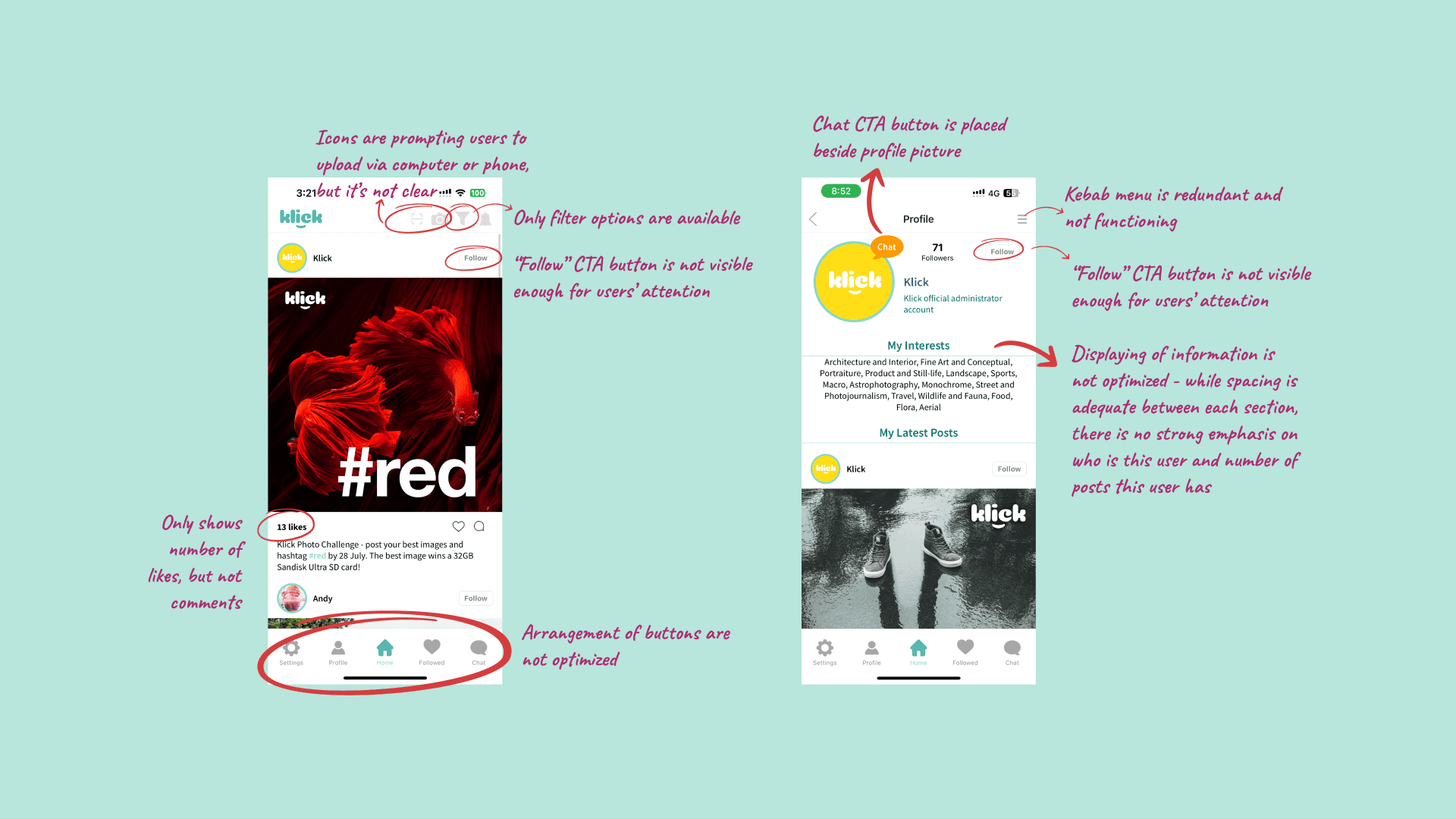
There are a few critical issues that were discovered, which had impacted the fundamental usability and lacking of user interactions of this app:
No search function: Users can't search hashtags, keywords, or other users, making it difficult to find specific content despite having genre filtering.
Poor navigation flow: Button placement in the lower navigation bar is inconsistent with standard social app layouts, increasing the learning curve.
Flawed information display and CTA buttons: Captions lack expansion indicators, comment counts are missing, upload dates are absent, and the "Follow" button is not prominently displayed.
Process
My design process is as follows:
User feedback collection and personal app testing
Comparative analysis with Instagram
Synthesizing findings and ideating solutions
Prioritizing and wireframing solutions
Before/after feedback gathering
During wireframing, I maintained the app's brand identity by preserving its existing fonts and color scheme.
Solution
The improved UI of Klick app features:
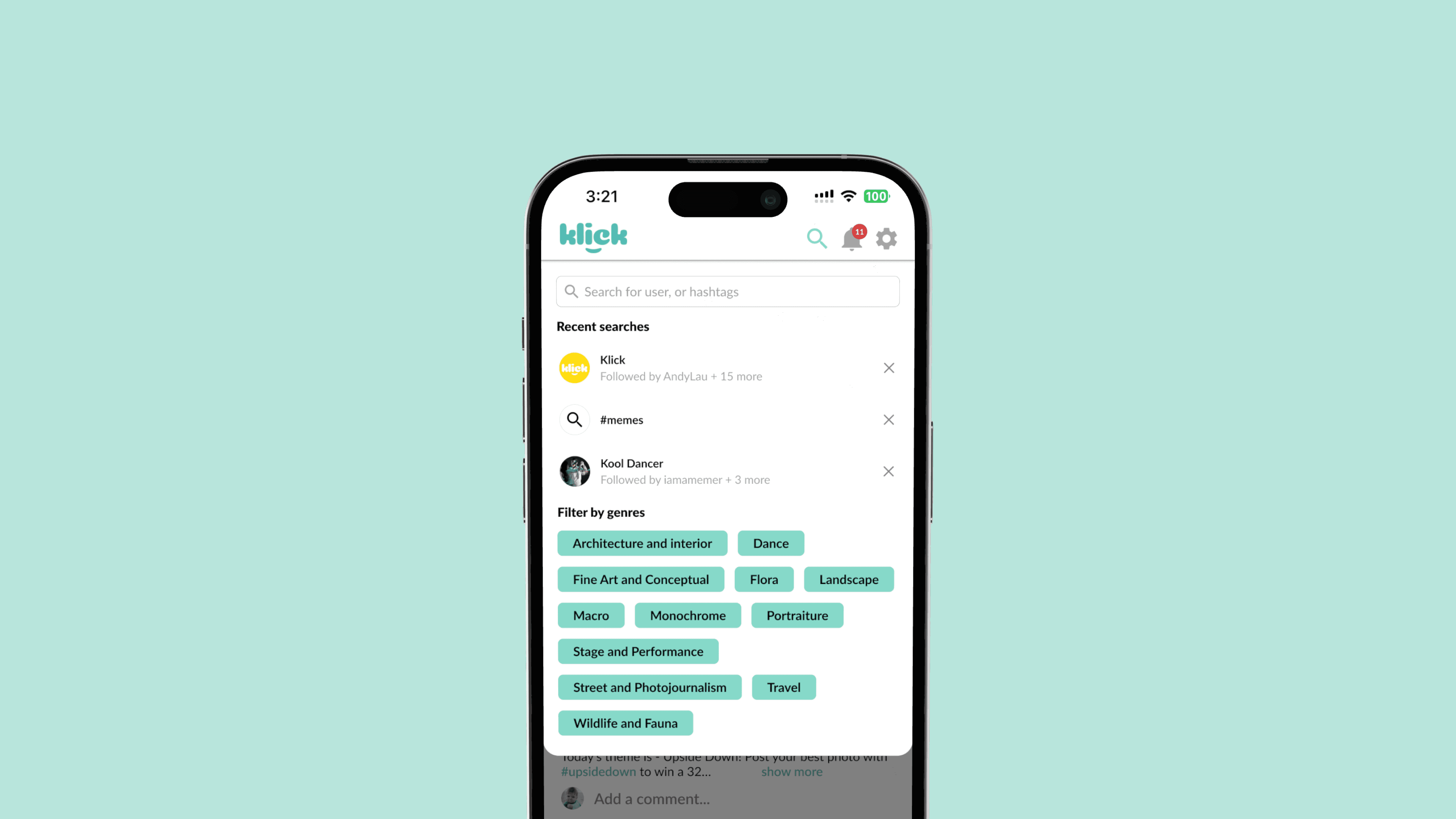
Enhanced search functionality: A prominent search button integrated with filtering options, allowing users to easily find and customize content based on their preferences.
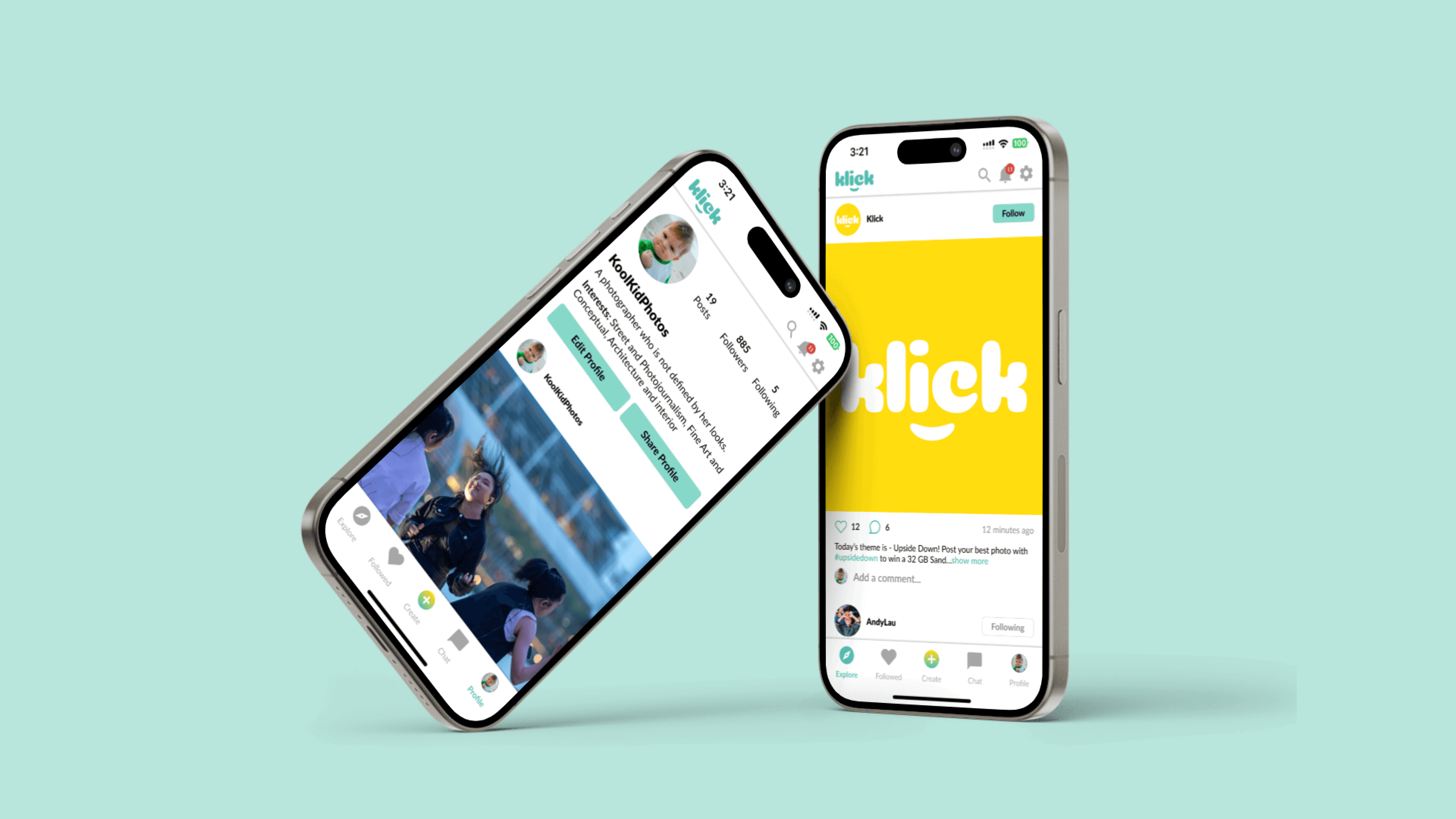
Intuitive navigation: A redesigned bottom navigation bar mirroring Instagram's layout, reducing the learning curve and improving user familiarity.
Informative content cards: Redesigned to display clear call-to-action buttons for following users, post dates, engagement metrics (likes and comments), and an expandable caption feature. Users can also quickly leave comments directly from the card.
Optimized profile pages: A revamped layout emphasizing user identity, with more visible call-to-action buttons and clearer presentation of user information and content.
These improvements aim to enhance user experience, increase engagement, and streamline content discovery within the Klick app ecosystem.
Results and Takeaways
As a photographer and product designer, I've undertaken this passion project to enhance both the aesthetics and functionality of the app. I've conducted before-and-after tests with five fellow photographers, though broader user testing would be beneficial. Through this process, I have realized the importance of fulfilling the fundamentals of user experiences of a product.
A key consideration for future development is the app's product strategy. To ensure sustainable user growth, it should offer a unique value proposition that differentiates it from mainstream platforms like Instagram.


